Please note that the linked page has undergone very slight modifications since my involvement in the project to accomodate new issues of the newsletter. For a carbon copy of the site as I created it, refer to the (much slower and unoptimized) archive.org version.
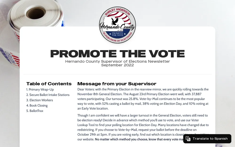
I made this single-page website for the Hernando County Supervisor of Elections. They had been publishing a pdf newsletter regularly, and distributing it digitally… I figured since it wouldn’t be printed anyway, it’d be better as a website. It was my first big project with Astro, and I definitely learned a lot from it.
What did you learn?
Data manipulation. I was digging through the main hernandovotes.gov website and found that there are dynamically updated election stats throughout the site. By searching through the source files and network requests, I found that all this data comes from one source, which is public (albeit hidden in the source code).
I hadn’t worked with an API on this scale yet, and it was a lot of data to sort through, so that was a big deal at the time. All of the stats in the newsletter is pulled from the json, most have to be calculated from the mass of data in the file.
{
  "Summary": {
    "TotalRegisteredVoters": 146758,
    "ElectionName": "2022 Primary Election",
    "ElectionDate": "08/23/2022",
    "LastUpdatedTime": "2022-09-06T03:50:02.5093378+00:00",
    "CountyName": "HERNANDO",
    "FvrsElectionNumber": 26905
  },
  "PrecinctSplit": {},
  "Location": {},
  "HideTypes": [],
  "Turnout": {
    "DateType": {},
    "PartyType": {},
    "LocationParty": {
      "EarlyVoting": {},
      "ElectionDay": {}
    },
    "PrecinctType": {}
  }
}
Here’s a simplified version of the json I was working with, but don’t be fooled - the original was almost 900 lines long. The output data is placed in cards or charts, which are built using components.
Charts. I knew that I wanted to display data visually too, somehow. I landed with Chart.js to accomplish this, which creates interactive HTML5 charts. I also added a noscript backup, in case the browser had Javascript disabled, so the charts could be loaded via image. I hadn’t worked with charts before, so this was definitely a learning experience.
Translation. One of the major features was internationalization (aka. i18n), which allowed the visitor to read the newsletter in Spanish. Each section was translated individually as components, which definitely made everything more complex in the codebase — but it was the last step in the project, so it’d just have to be restarted for the next issue. If I were to implement a similar feature again, I’d definitely put more time into making sure the implementation was clean and easy to update for the next issue.
Fonts. Funny enough, custom fonts presented an issue I’d never had before. I had purchased a license for the headline font (which is “MADE Outer Sans”) for personal projects before, but a government license was entirely different. I sent an email to the font publisher and they gave me permission to use it for free. Nothing necessarily difficult, but I thought it was cool.
Image compression. At the time, I didn’t feel like the Astro Images integration wasn’t suitable for production, so I ended up using Gumlet for image optimization. Looking back, this wasn’t a great solution… the images are optimized upon request, so it takes an extra second(ish) to load the image while Gumlet is compressing it.
To work around the extra loading time, I set all the images that weren’t in the onload viewport to lazy load. While that did decrease pageload time, it also made it so that the images may not have started loading until it comes into view.
This compression method also presents some pretty large visual issues with the logo and background upon page load. I created the logo in svg, but Gumlet is set to “compress” it to webp upon load, which creates a blank spot in the page header for a split second, and also introduces fairly significant layout shift. The background is also blank until it processes. Both of these would improve UX by a lot, I think.
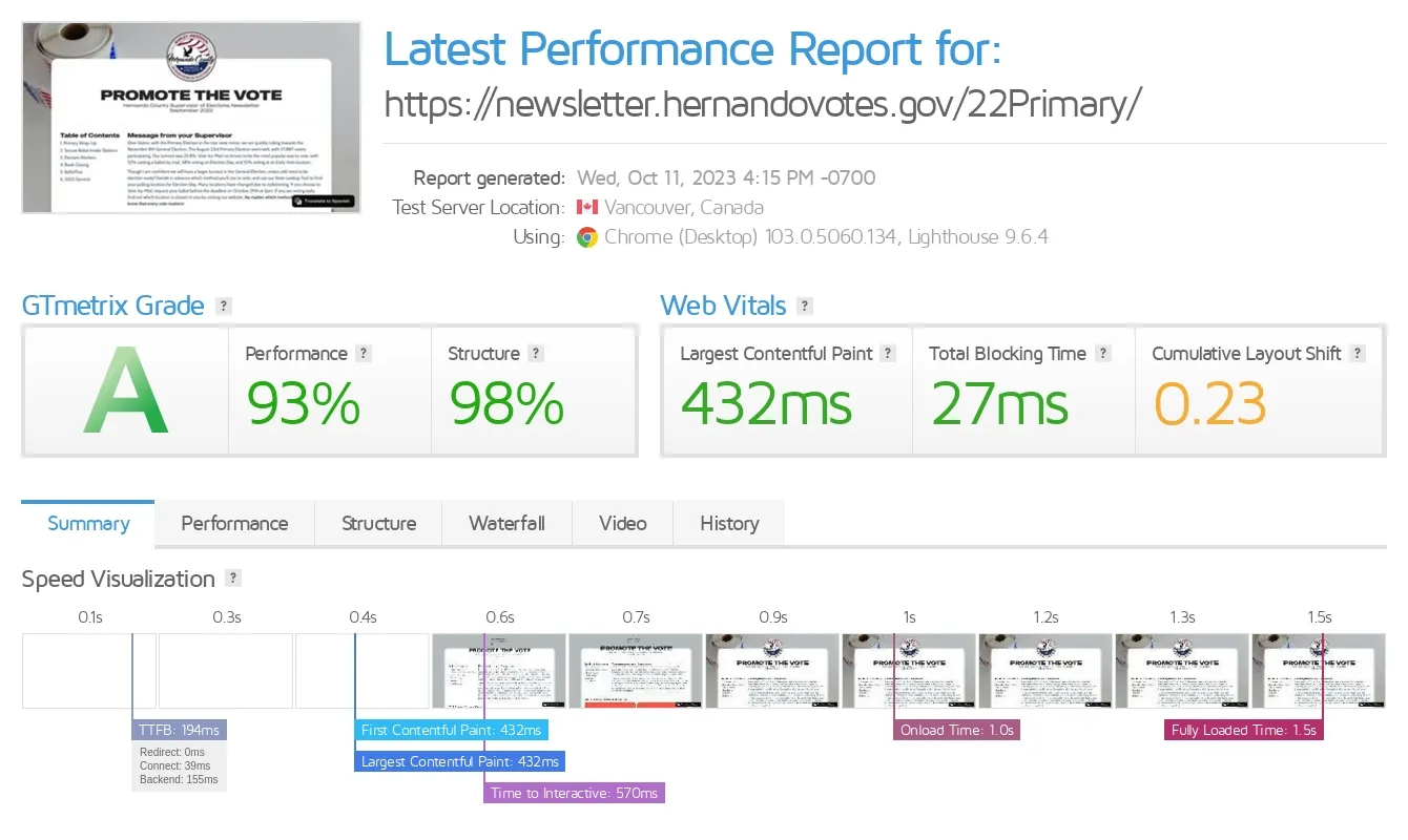
The GTMetrix numbers aren’t terrible though:
Visit an archive of the project: newsletter.hernandovotes.gov